ShopDreamUp AI ArtDreamUp

Deviation Actions


Description
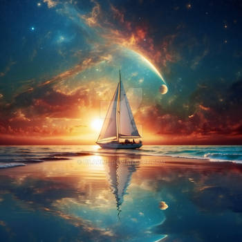
I really enjoyed making this digital painting, I love working with lighting in my work and thats why I got inspired by painters like Turner and Whistler for this one.
Made in Photoshop
Made in Photoshop
Image size
1500x2000px 1.16 MB
© 2010 - 2024 Betelgeuze01
Comments166
Join the community to add your comment. Already a deviant? Log In
Very lovely work! The color scheme is beautiful. Someone else mentioned this already, but using a limited color palette can be difficult but you've pulled it off very well here.
The detail on the ships look fantastic. (However my knowledge of ship rigging is pretty much non-existent so I can't comment on the accuracy). I love how you've distorted the reflections in the water.
The buildings in the back have a sort of ghostly, otherworldly feel with the way that you've got the edges glowing.
I like the sort of murky, hazy sky and the texture that you've applied to the whole piece, it makes for a mystical yet almost peaceful mood.
A couple things for critique-
I feel like the highlights on the water could be brighter or maybe more defined. Although the lighting is rather soft and murky, since water is so highly reflective I would expect to see patches of light bouncing off the water, like where the ripples are. (hopefully this makes sense).
The only other thing I can think of is that the ships are nice and 3-d looking but the background with the city is kind of flat. There are the outlines of the buildings, but nothing behind them. It kinda looks like the buildings are all part of the same cut-out. If there were a few more buildings added in behind the current ones, colored a bit fainter to show atmospheric perspective, I think it would give a greater sense of depth.
Hope this helps!